On the Atlas VP site, every interaction is intentional and engaging. Custom cursor effects and animation cues that follow the user’s movement give the interface a lively, responsive character. Scroll animations and interactive sliders add depth and delight, turning browsing into a rhythmic, kinetic experience.
The design feels like more than a website. It feels like a crafted space where motion and design work together to make discovery feel effortless and fun.
_0001_Layer-3.png)
_0003_Layer-1.png)
_0000_Layer-4.png)
_0002_Layer-2.png)


The testimonial carousel is designed around user agency, allowing visitors to control the pace and direction of content through direct interaction. Drag-based movement reduces cognitive load by revealing one focused message at a time, while scale and spacing reinforce hierarchy and readability. This approach frames social proof as something discovered, not pushed, making it feel more credible and considered.
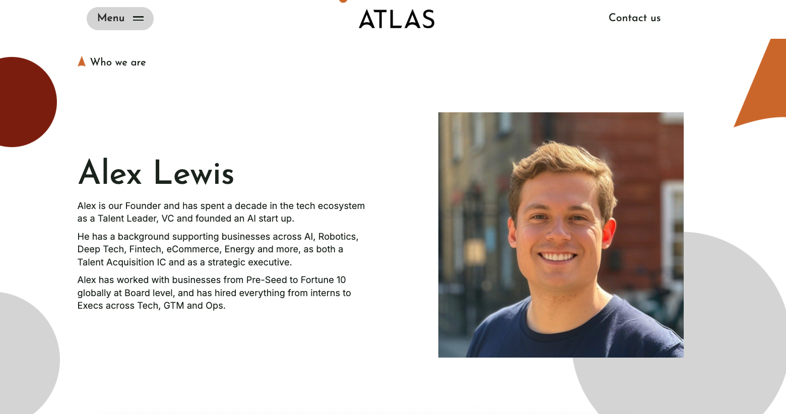
This profile layout combines editorial-style typography with generous white space to give the founder real presence and credibility. Clear hierarchy guides the eye from name to story, while the large portrait adds warmth and authenticity. The balance of structure and openness helps the narrative feel personal, confident, and easy to engage with.
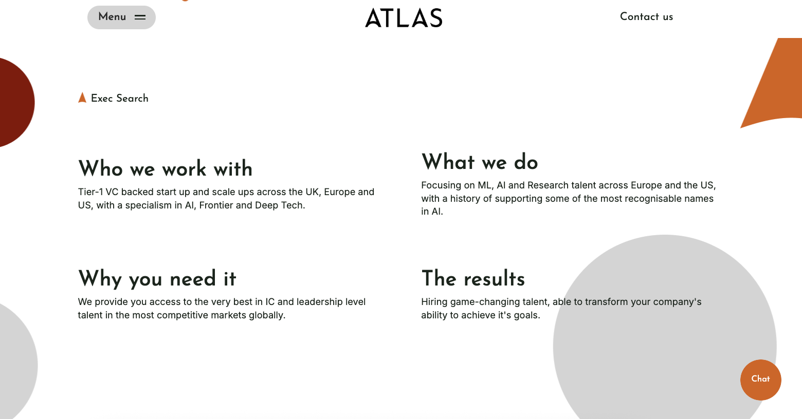
This section breaks complex service information into a clear, modular grid that’s easy to scan and quick to understand. Short, focused headings guide the narrative from audience to outcome, while the open layout and generous spacing keep the content feeling calm and confident. It allows visitors to grasp value and relevance at a glance, without needing to wade through heavy explanation.