A Few of My Greatest Hits

Welcome to my portfolio β€” a collection of websites I’ve designed, built, polished, and occasionally sweet-talked into behaving.

Explore my latest project

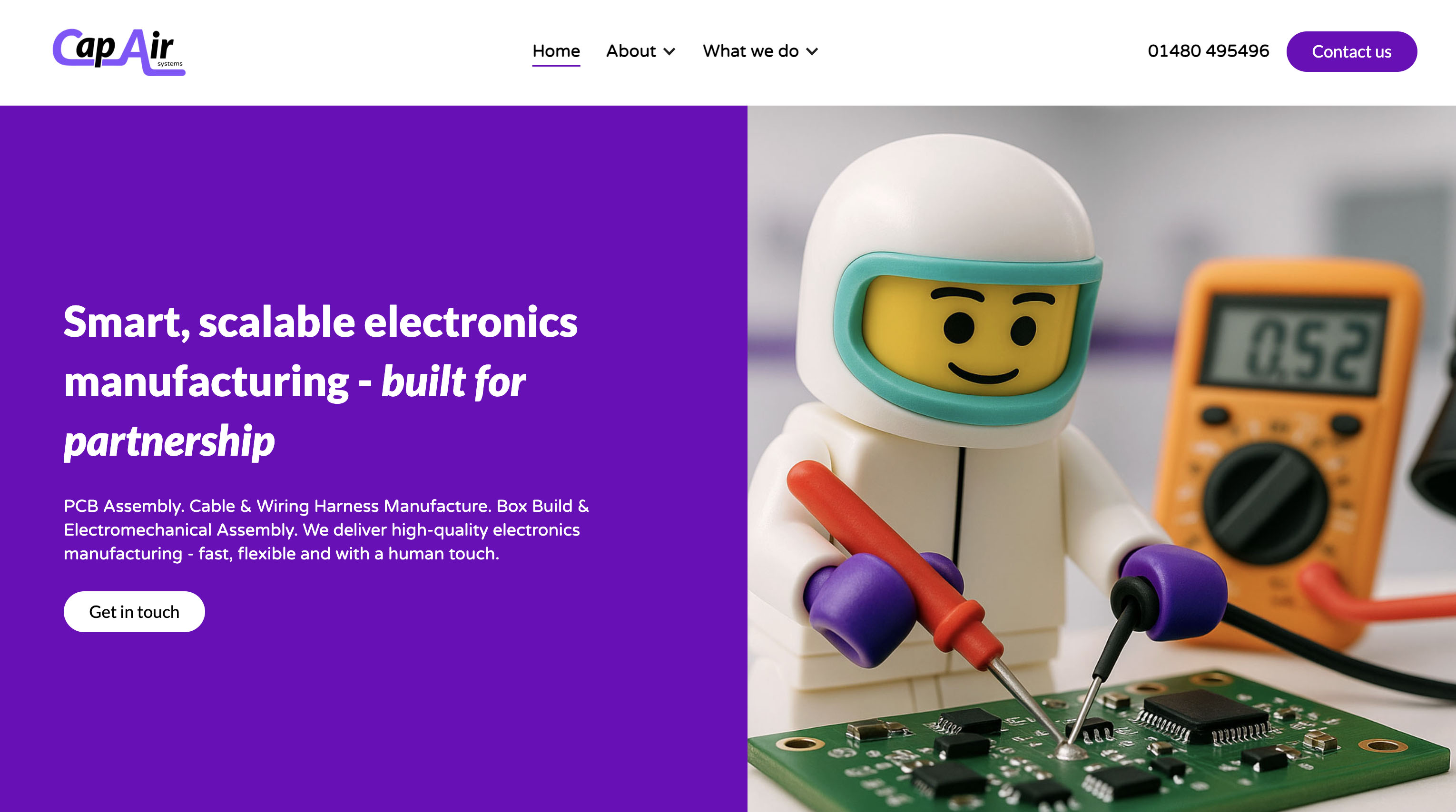
Cap Air Systems

A functional, flexible, and friendly online presence for a sophisticated industrial business - proving that even wiring harnesses can have web charm. πŸš€

Check out the project
click me

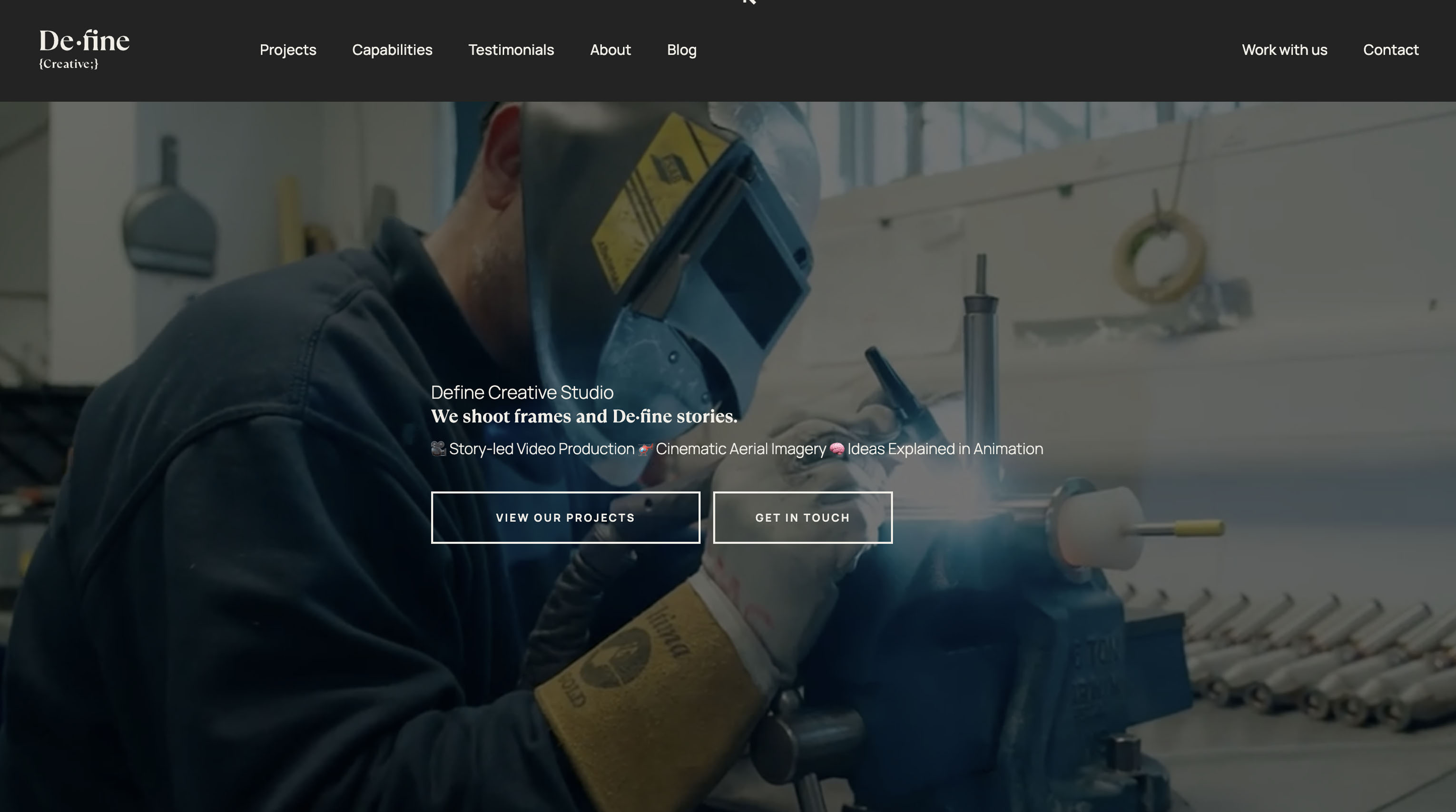
Define Creative

A bold, expressive, and visually driven online presence for a creative studio - cinematic, confident, and built to showcase standout work. 🎬

Check out the project

click me

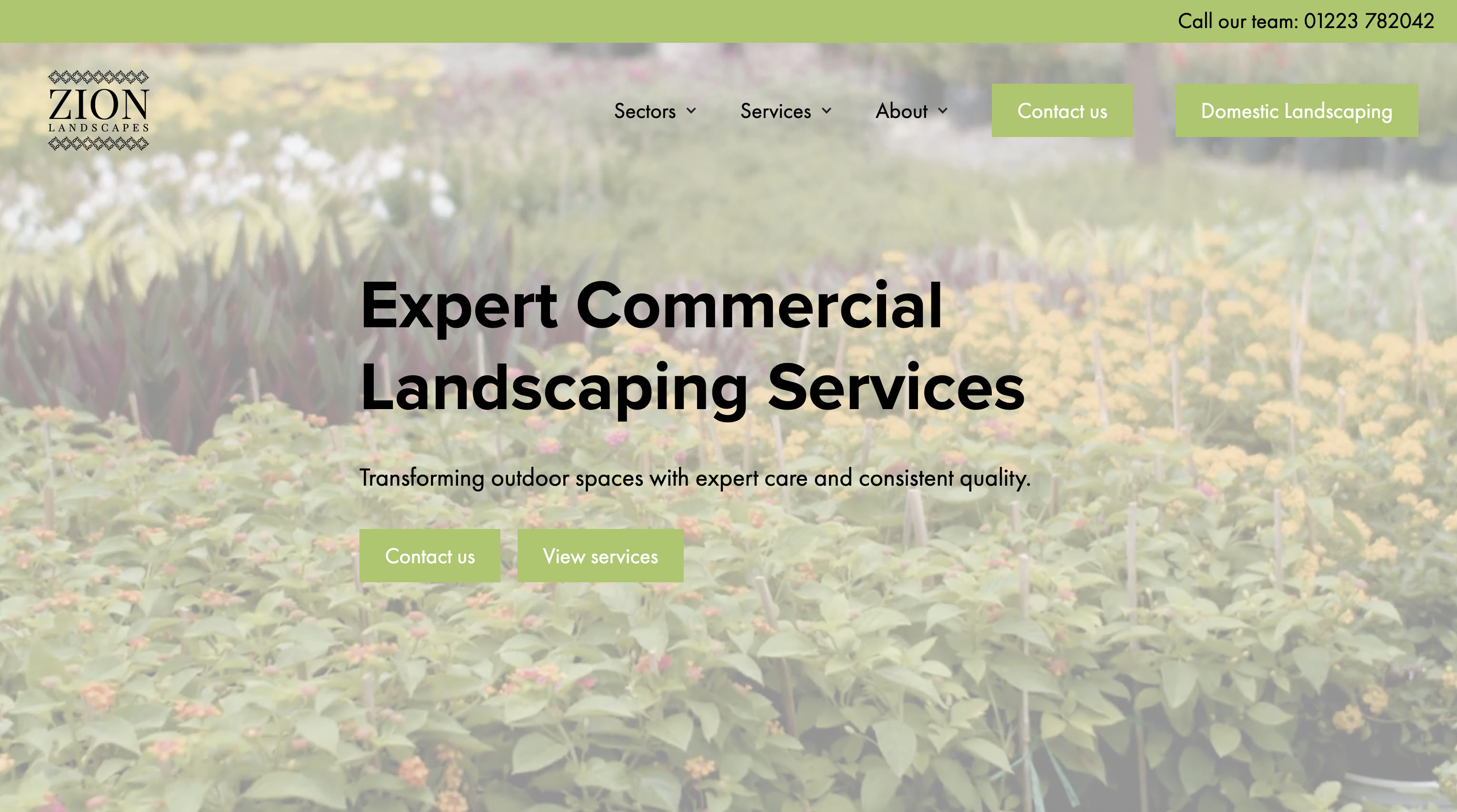
Zion Landscapes

A natural, professional, and visually grounded online presence for a landscaping company β€” designed to showcase outdoor spaces at their best. 🌿

Check out the project

click me

Busy Bee Recruitment

A robust, user-first recruitment platform, built around powerful search, smart filtering, and seamless job discovery. 🐝

Check out the project

click me

You need more?

Wow, you're greedy. But fine, scroll down to see even more of my websites. Be warned, you'll want one once you're done.

LimbMatch

From a one-page funding pitch to a full-stack membership platform connecting manufacturers, clinics, and wearers.

Check out the project

The Detail

A site built to feel like an experience, not a page you scroll through β€” heavy GSAP and ScrollTrigger work throughout.

Check out the project

Cambridge Cyrenians

Bringing warmth and clarity to a charity site that needed to speak to donors, service users, and supporters all at once.

Check out the project

Zion Landscapes

Building a commercial arm from the ground up for a business that had only ever traded domestically.

Check out the project

Cap Air Systems

Making electronics manufacturing feel a lot less intimidating, and a lot more human.

Check out the project

Busy Bee Recruitment

Check out the project

Jade Pathway Clinic

Turning a static brochure site into a booking-first platform the clinic can run entirely themselves.

Check out the project

Driveaway School of Motoring

Turning a dated, static site into an instructor-matching platform wired directly into the business's lead pipeline.

Check out the project

Define Creative

Rebuilding a one-page site into a full project-led platform, so a video studio's work could finally be shown in full.

Check out the project

You need more?

Wow, you're greedy. But fine, scroll down to see even more of my websites. Be warned, you'll want one once you're done.

Cambridge Cyrenians

Stat cards use flat, unembellished presentation deliberately β€” no counters, no dramatic scale-up animation β€” so the numbers read as credible fact rather than a fundraising tactic. Tone stays consistent across copy and imagery so the site never has to switch registers between "informing" and "asking."

Check out the project

Zion Landscapes

Most competitors compress their offering into a handful of generic services to look tidy. Here the full catalogue β€” 11 sectors, 30-plus services β€” is left visible in the nav deliberately: for a buyer comparing contractors on breadth of capability, hiding it would cost more credibility than a dense menu loses.

Check out the project

Driveaway School of Motoring

A driving lesson is a high-anxiety purchase for a lot of learners, so "especially good with nerves" sits as a stated trust factor alongside DVSA approval and transparent pricing β€” reassurance treated as functionally important as credentials, not just a nice-to-have line in the copy.

Check out the project

Jade Pathway Clinic

Copy leans on words like "balance" and "wellbeing" rather than symptom-and-fix language, positioning the clinic alongside wellness rather than purely medical treatment, which matters for how it competes and prices against both GPs and spas.

Check out the project

Define Creative

The nav surfaces the three service lines (video production, aerial imagery, animation) as top-level items rather than burying them under a generic "services" dropdown β€” signals specialism over generalist agency positioning before a visitor reads a word of copy.

Check out the project

Busy Bee Recruitment

A robust, user-first recruitment platform β€” built around powerful search, smart filtering, and seamless job discovery. 🐝

Check out the project

Cap Air Systems

Bold colour and confident messaging replace the old site's stiff, corporate feel. A split layout pairs clear copy with characterful imagery, so ideas like sustainability and quality land as things Cap Air Systems actually cares about, not boxes ticked on a page.

Check out the project

LimbMatch

The branding evolved deliberately alongside the project itself β€” what started as a simple, explanatory identity built to win funding could afford to lean into a more considered, modern brand once the idea had proven itself and the platform had real budget behind it. The visual identity today reflects a funded product, not a pitch deck.

Check out the project

The Detail

"Designing for the senses" is core to how the studio describes their own work β€” so a multi-sense interactive canvas component with dedicated Sight, Sound, Touch, Smell, and Taste hover zones isn't decorative, it's that idea made interactive. The build had to serve the concept directly rather than just look good alongside it.

Check out the project

LimbMatch

The branding evolved deliberately alongside the project itself β€” what started as a simple, explanatory identity built to win funding could afford to lean into a more considered, modern brand once the idea had proven itself and the platform had real budget behind it. The visual identity today reflects a funded product, not a pitch deck.

Check out the project

The Detail

"Designing for the senses" is core to how the studio describes their own work β€” so a multi-sense interactive canvas component with dedicated Sight, Sound, Touch, Smell, and Taste hover zones isn't decorative, it's that idea made interactive. The build had to serve the concept directly rather than just look good alongside it.

Check out the project

Cambridge Cyrenians

Stat cards use flat, unembellished presentation deliberately β€” no counters, no dramatic scale-up animation β€” so the numbers read as credible fact rather than a fundraising tactic. Tone stays consistent across copy and imagery so the site never has to switch registers between "informing" and "asking."

Check out the project

Zion Landscapes

Most competitors compress their offering into a handful of generic services to look tidy. Here the full catalogue β€” 11 sectors, 30-plus services β€” is left visible in the nav deliberately: for a buyer comparing contractors on breadth of capability, hiding it would cost more credibility than a dense menu loses.

Check out the project

Cap Air Systems

Bold colour and confident messaging replace the old site's stiff, corporate feel. A split layout pairs clear copy with characterful imagery, so ideas like sustainability and quality land as things Cap Air Systems actually cares about, not boxes ticked on a page.

Check out the project

Busy Bee Recruitment

A robust, user-first recruitment platform β€” built around powerful search, smart filtering, and seamless job discovery. 🐝

Check out the project

Jade Pathway Clinic

Copy leans on words like "balance" and "wellbeing" rather than symptom-and-fix language, positioning the clinic alongside wellness rather than purely medical treatment, which matters for how it competes and prices against both GPs and spas.

Check out the project

Driveaway School of Motoring

A driving lesson is a high-anxiety purchase for a lot of learners, so "especially good with nerves" sits as a stated trust factor alongside DVSA approval and transparent pricing β€” reassurance treated as functionally important as credentials, not just a nice-to-have line in the copy.

Check out the project

Define Creative

The nav surfaces the three service lines (video production, aerial imagery, animation) as top-level items rather than burying them under a generic "services" dropdown β€” signals specialism over generalist agency positioning before a visitor reads a word of copy.

Check out the project
Heard it on the grapevine

Wiggle have been such a hidden gem for us, helping take our own and our clients websites to another level. Lauren specifically is a pleasure to work with. Her knowledge across so many varied platforms means there vary rarely is a situation where she can't come up with a great solution.

Jordan Alexander, Define Creative

Lauren has built two websites for me now, including a full brand discovery. Really impressed with the work both times and she is a great sounding board for all things web and design.

Alex Lewis, Atlas VP

I've been building and maintaining my company websites for the past 20 years. It took so much time out of my week, month, years. Then, I was introduced to Lauren. She took charge and created a brand new Website for the company. Nothing was too much trouble for her. She is so knowledgeable and efficient. Thanks so much for your help Lauren πŸͺ„βœ¨

Raymond Christofides, Driveaway School of Motoring

Sometimes you just need someone to take away the headache and stress of figuring out how your website should look, function, engage your audience, and help grow your online presence, and Lauren does exactly that. She takes a full overview, gives you clear direction on what needs to be done and how to do it, and then implements everything beautifully.

Rachel Hales, Get Synergised