

01 - The brief
The brief called for stronger brand presence, higher donor appeal, and clear service information for two very different reader groups — people needing support and the people supporting them — without any group having to filter through content meant for another. Increasing donations sat underneath all of it as the commercial goal.
02 - The first impression
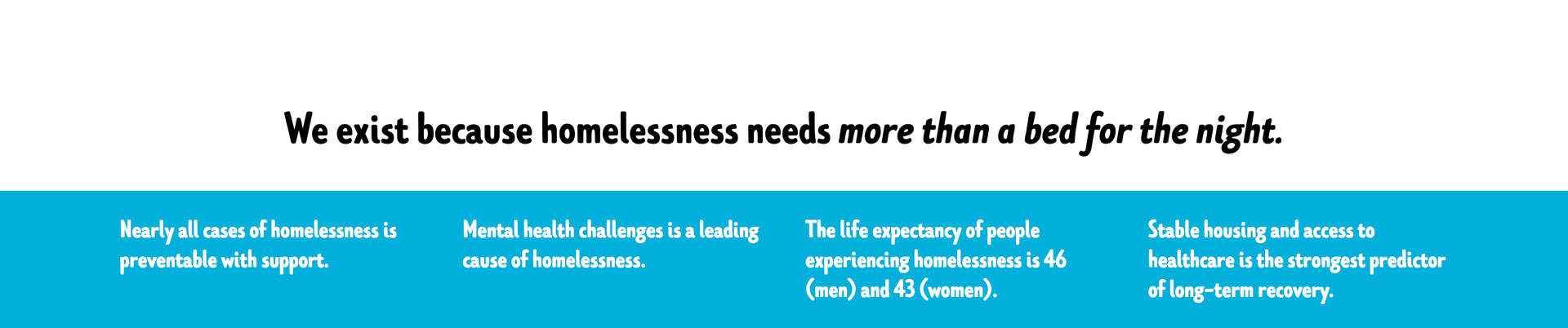
A single declarative statement replaces the usual charity mission paragraph, reducing time-to-comprehension to near zero. Two equally weighted CTAs split the hero's conversion path immediately — service access and donation — rather than forcing every visitor down one funnel before branching.

03 - Brand + Tone
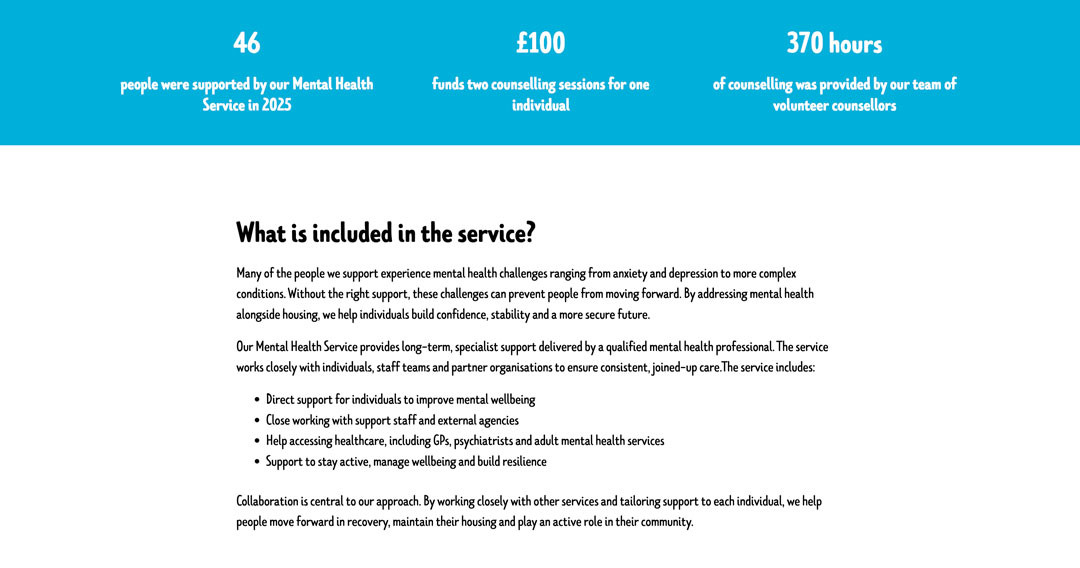
Stat cards use flat, unembellished presentation deliberately — no counters, no dramatic scale-up animation — so the numbers read as credible fact rather than a fundraising tactic. Tone stays consistent across copy and imagery so the site never has to switch registers between "informing" and "asking."
04 - Structure + Flow
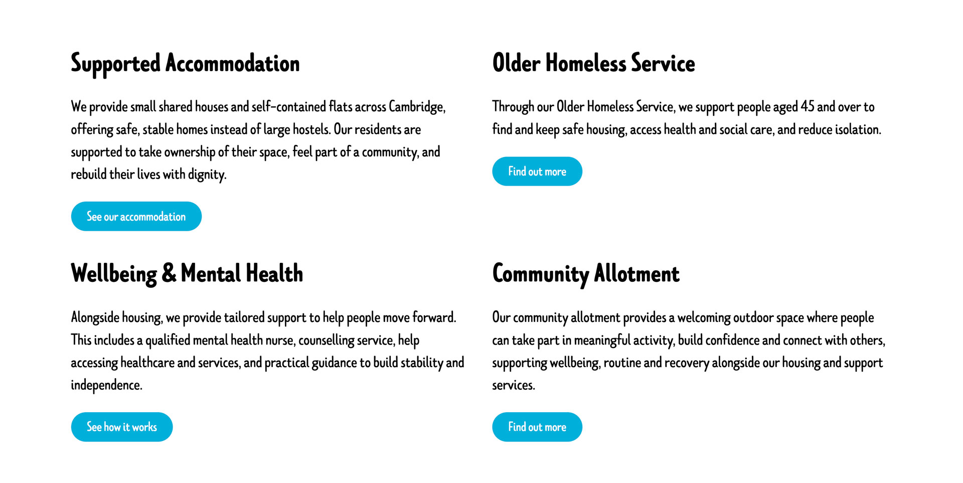
Services are grouped as parallel, equally weighted cards rather than a ranked list, since no one service is more important than another to the person looking for it. Further down, the page forks explicitly by visitor intent — get help, refer someone, get involved — so navigation decisions happen by role rather than by guessing which menu item applies.
05 - The details
The resident quote sits directly adjacent to the statistics block rather than in a separate testimonials module. Co-locating qualitative and quantitative evidence means a reader doesn't have to hold the stat in memory while scrolling to find supporting proof — it's argued in one pass.

06 - The build
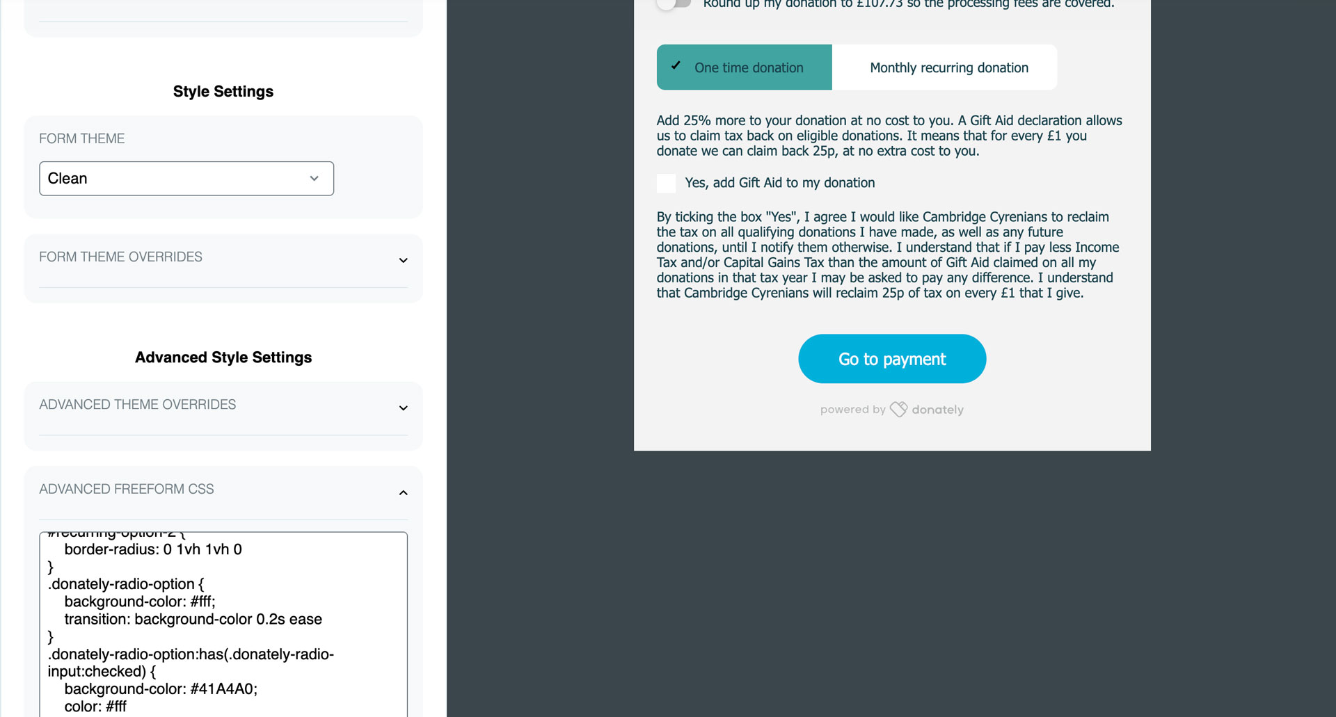
Built on Webflow with a native form handling newsletter signup, custom success and error states, and Donately integrated directly into the donation flow for a seamless, on-brand giving experience rather than an off-site redirect. Referral and volunteering run as separate, purpose-built pathways, each with its own CMS structure so content can be updated independently without touching the others.
07 - The result
Cambridge Cyrenians now has a website that truly reflects the quality of their work — built around the people who use it, and structured to keep donations moving in the right direction.

_0000_Layer-4.png)
_0001_Layer-3.png)
_0002_Layer-2.png)
_0003_Layer-1.png)