

01 - The brief
Cap Air Systems' old site opened with a click-to-enter screen and navigation that hadn't moved on since the early 2000s. The brief was simple in theory, brutal in practice: drag a genuinely good business out of the dial-up era and into something that actually reflects the quality of the work they do.
02 - The first impression
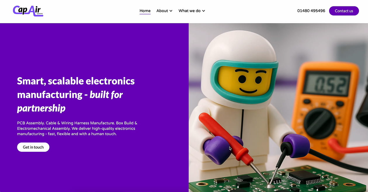
A single, benefit-led headline paired with one clear CTA keeps the hero focused rather than crowded. The illustrative visual replaces the generic factory-floor photography competitors default to, buying instant differentiation before a single line of body copy loads.
03 - Brand + Tone
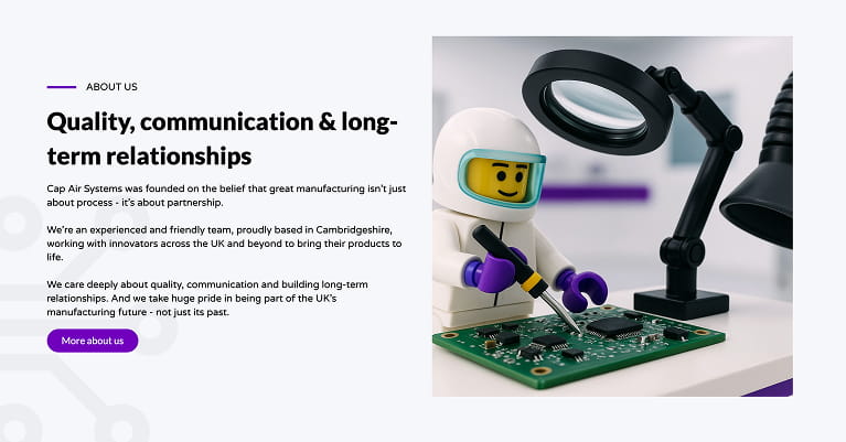
Bold colour and confident messaging replace the old site's stiff, corporate feel. A split layout pairs clear copy with characterful imagery, so ideas like sustainability and quality land as things Cap Air Systems actually cares about, not boxes ticked on a page.
04 - Structure + Flow
The old navigation forced visitors through a gate before they could see anything. The new structure gets straight to the point — a clear main nav, sections that build logically from homepage to services to team, and nothing standing between a visitor and the information they came for.
05 - The details
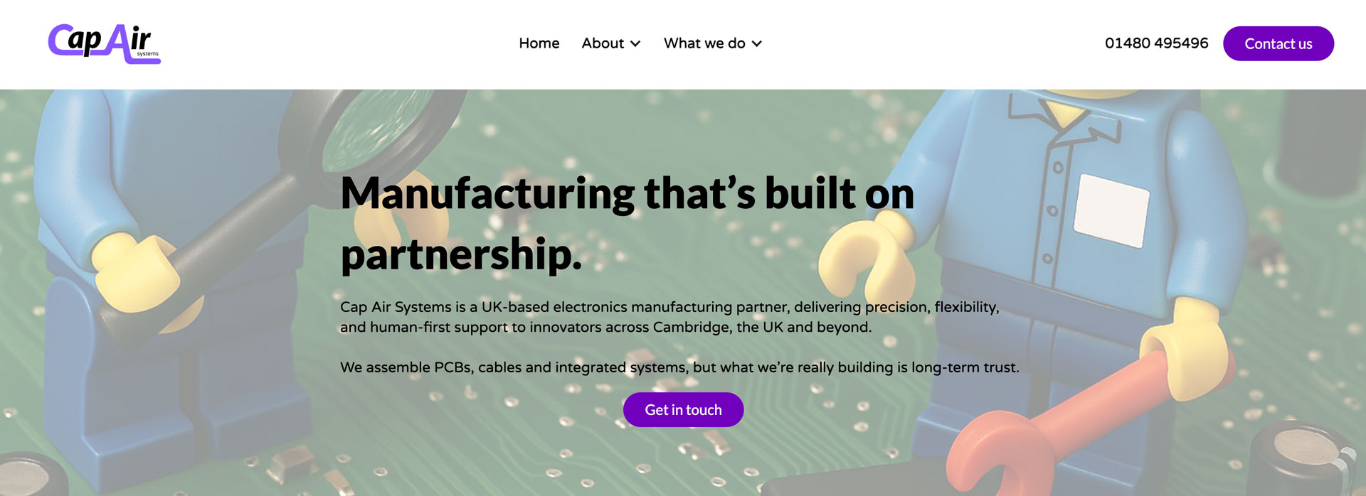
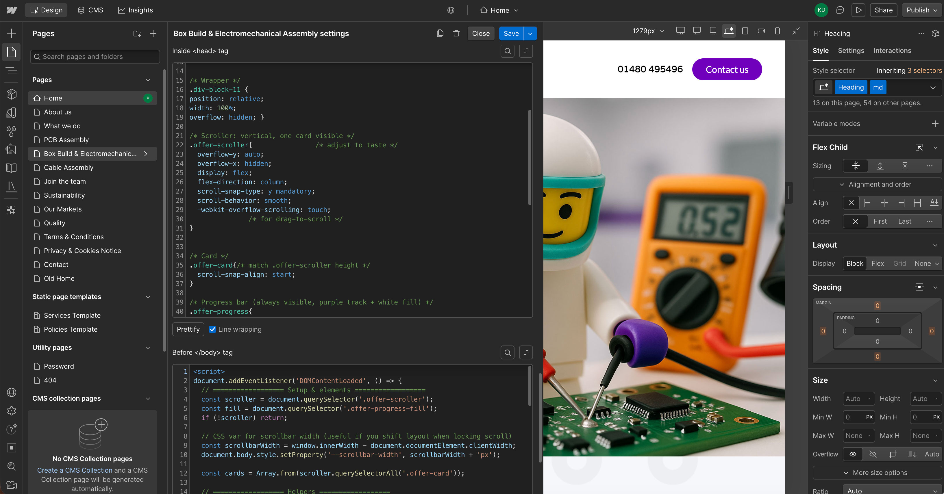
Rather than stock photography of factory floors, the site leans on a recurring visual joke — Lego figures mid-build on real circuit boards — to keep a technical, process-heavy business feeling approachable and a little bit fun.
06 - The build
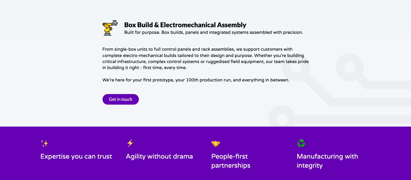
A fully responsive Webflow build replacing what had essentially been a static, unmaintained site for years. Three core service pages — PCB assembly, cable assembly, and box build & electromechanical assembly — sit on a structure the Cap Air Systems team can update themselves.
07 - The result
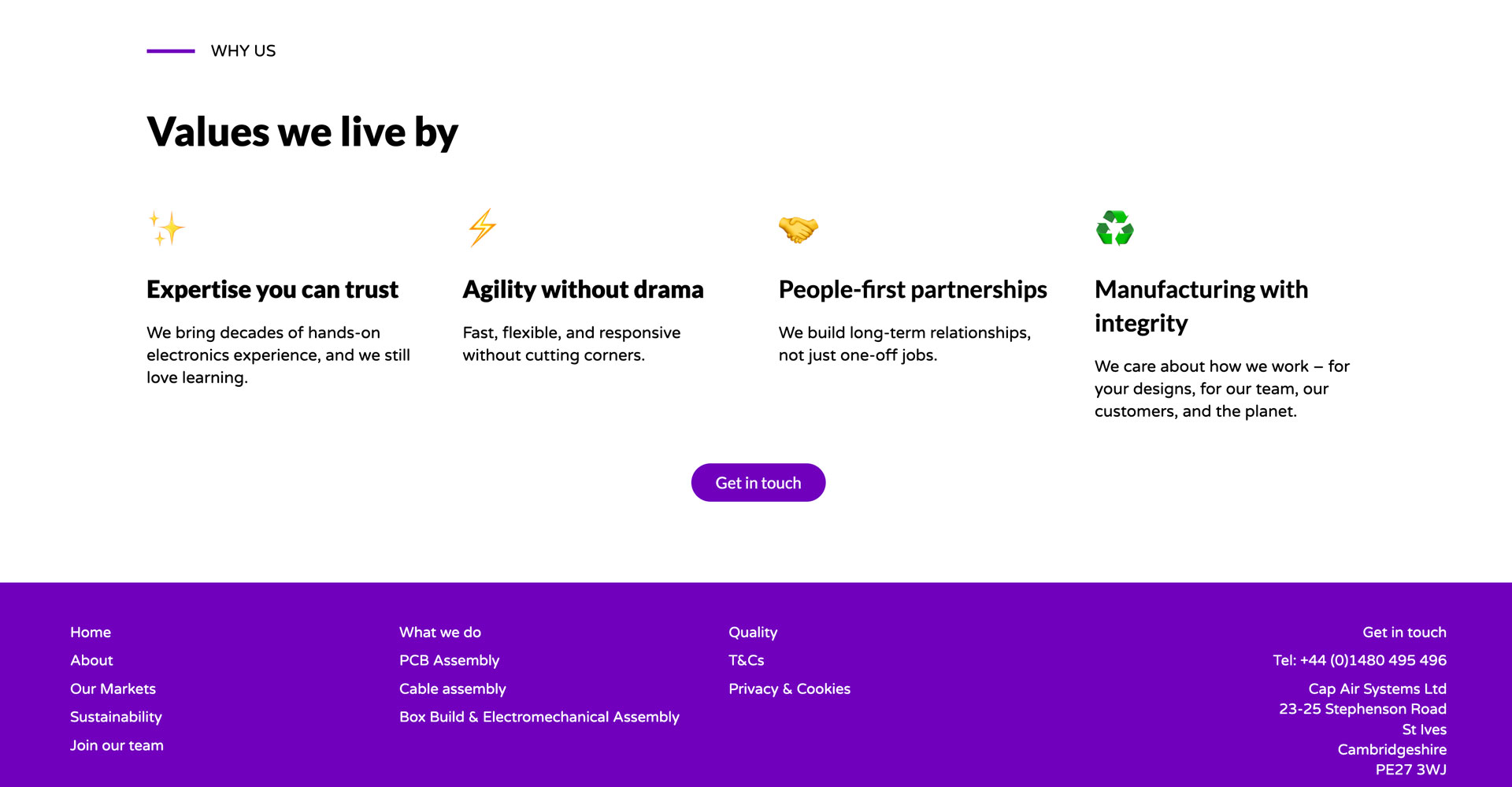
Cap Air Systems now looks like what it is — a modern manufacturing partner serious about quality, with values (expertise, agility, people-first partnerships, integrity) presented as clearly as the services, and a homepage that welcomes people in instead of gatekeeping them behind a click-to-enter screen.

_0000_Layer-4.png)
_0001_Layer-3.png)
_0002_Layer-2.png)
_0003_Layer-1.png)