


01 - The brief
The client's brief wasn't a list of pages or features — it was a visual aim: create a website that felt like an experience rather than a site you scroll through. That's a genuinely different design problem, and it pushed the build well past standard Webflow interactions into heavily custom, purpose-built animation work almost throughout.
02 - The first impression
The load screen doesn't drop the visitor straight into the homepage — it lets them in slowly, gradually revealing the hero section as the first hint of what the experience is about. That pacing decision sets the tone for everything after it: if the site treats each section as a step in a journey rather than a page to skim, the very first moment has to teach the visitor to slow down too.

03 - Brand + Tone
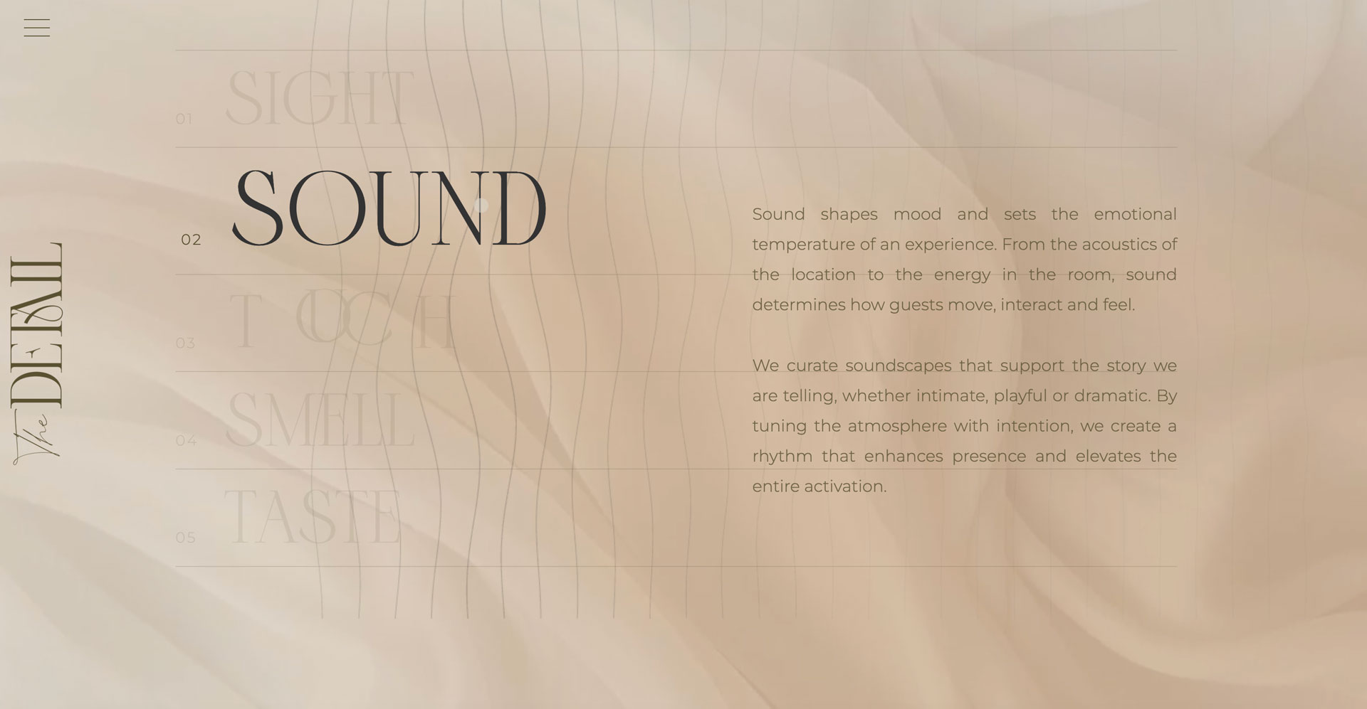
"Designing for the senses" is core to how the studio describes their own work — so a multi-sense interactive canvas component with dedicated Sight, Sound, Touch, Smell, and Taste hover zones isn't decorative, it's that idea made interactive. The build had to serve the concept directly rather than just look good alongside it.
04 - Structure + Flow
Every section transitions into the next rather than simply appearing — the site is paced more like a piece of film than a webpage, where each scroll is a deliberate cut rather than a jump straight to the next block of content.
05 - The details
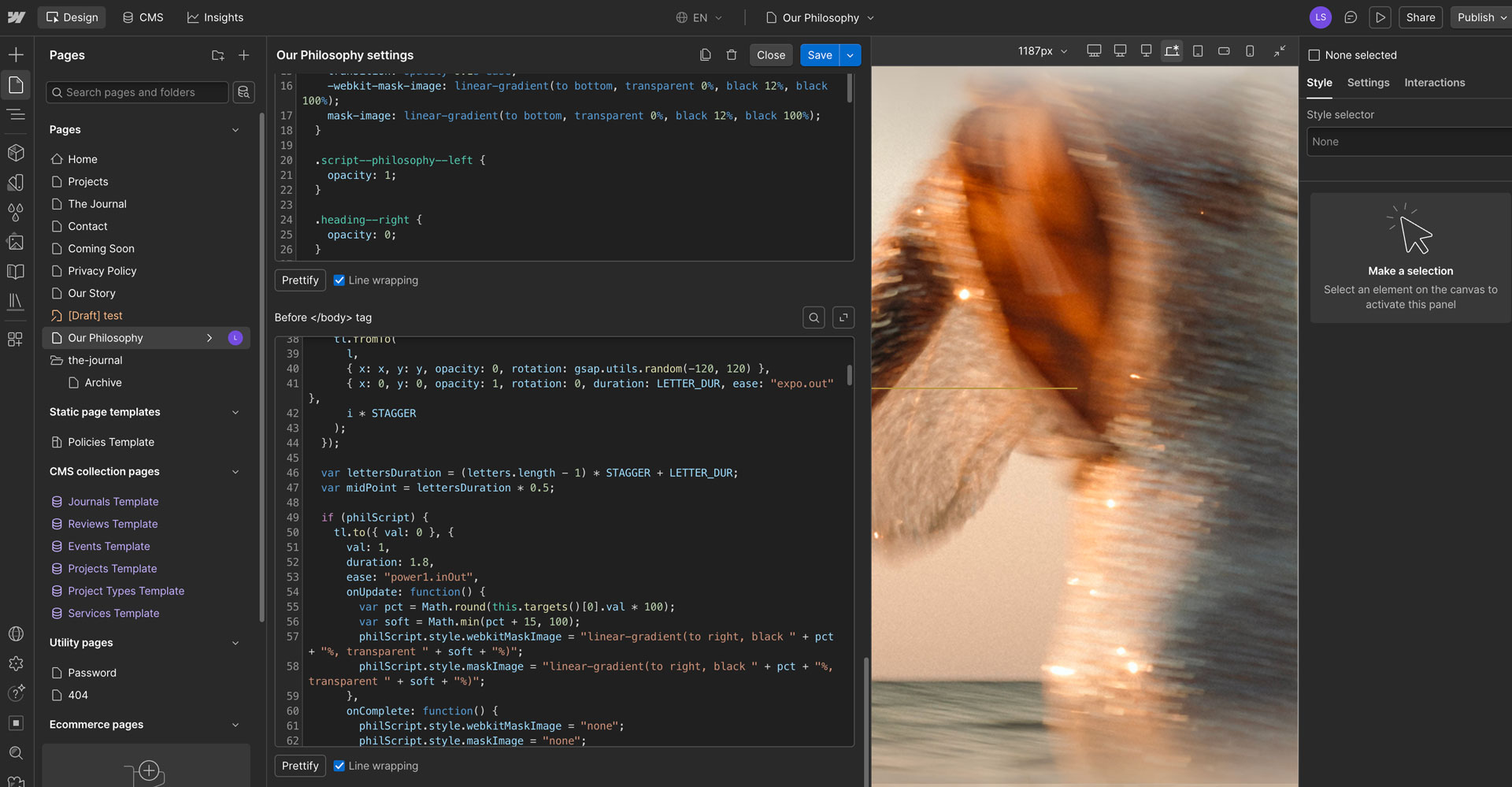
The whole site was designed completely custom, with client input from start to finish — every section built on its own custom HTML, CSS, and script rather than assembled from existing components. That freedom to add fully custom elements wherever the design called for it meant there was really no ceiling on what the site could do, only on how much time there was to build it.
06 - The build
Built on GSAP and ScrollTrigger throughout, with a handful of moments that carry the whole "experience" idea:
Letters that fly in
Headline text doesn't just fade up — individual letters animate into place, giving even a simple line of copy a bit of sourcery before the eye settles on it.
Sound in the senses zone
The Sound hover zone in the multi-sense canvas plays a gentle bird sound — a small, unexpected detail that makes "designing for the senses" a literal, audible experience rather than just a line of copy.
A load screen that sets the tone
The slow load reveal isn't a spinner to wait out — it's the first beat of the journey, easing the visitor in before the hero even appears.
A journal CMS built to flex
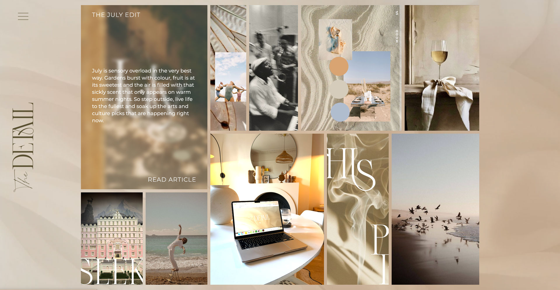
A multi-purpose journal CMS handles genuinely varied content types within one flexible structure, rather than forcing every entry into an identical template.
The brands list, in motion
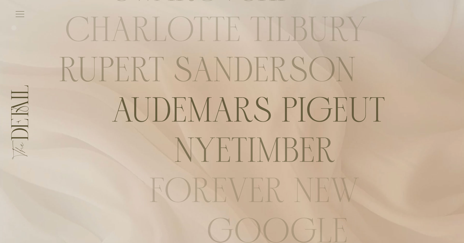
The client/brands list moves in a snake-like path rather than sitting in a static row — a small piece of choreography in a section that's usually the most static part of any site.
A background that never stops
An animated background runs throughout the entire site rather than being confined to the hero — keeping the sense of motion present on every single page, not just the first one.
07 - The result
The brief asked for an experience rather than a website, and that's what got built — a site with no static section left untouched by motion, built entirely custom from the ground up with the client involved at every stage. From the slow load reveal that sets the pace, through to the sensory hover zones, the flying letters, and the constant background motion, every piece exists to serve that original brief rather than to decorate it.

_0000_Layer-4.png)
_0001_Layer-3.png)
_0002_Layer-2.png)
_0003_Layer-1.png)
