

01 - The brief
The brief was to build a site with real personality — reflecting Katrina and Helen themselves, not the buttoned-up, interchangeable tone a lot of consultancy sites default to. They have an edge, and the site needed to show it. On top of that: they had no imagery to work with, and everything they offer needed to be shown clearly without the page tipping into overwhelm.
02 - The first impression
Rather than landing straight on a static hero, a loading and scroll animation reveals it instead, giving the intro some flare and putting the site in motion before a visitor has even started scrolling properly.

03 - Brand + Tone
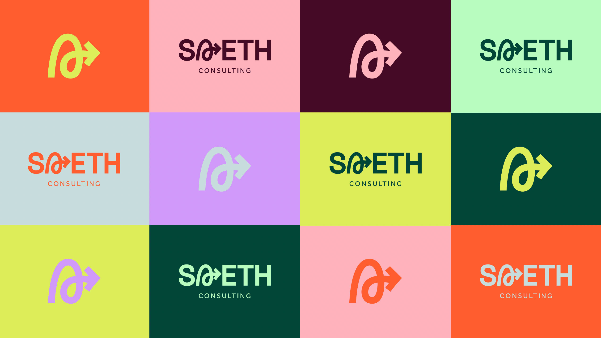
The bold palette and the strong spiral stamp mark were meant to be used a lot, not rationed. Block colours and hover colour changes carry through the whole experience rather than being reserved for a hero section and toned down everywhere else. The goal was to illuminate the branding, and keeping that vibe consistent end to end is what actually makes it land.
04 - Structure + Flow
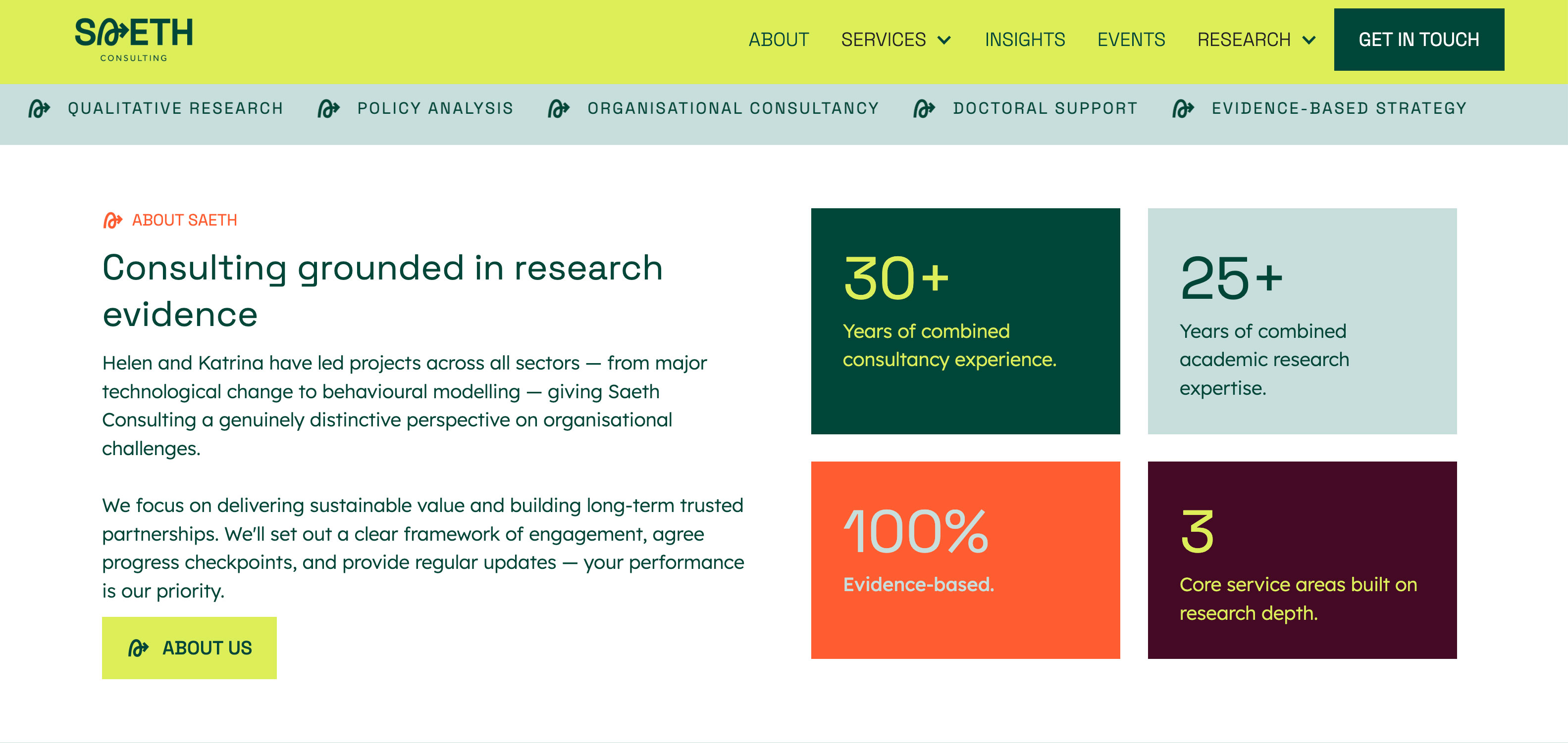
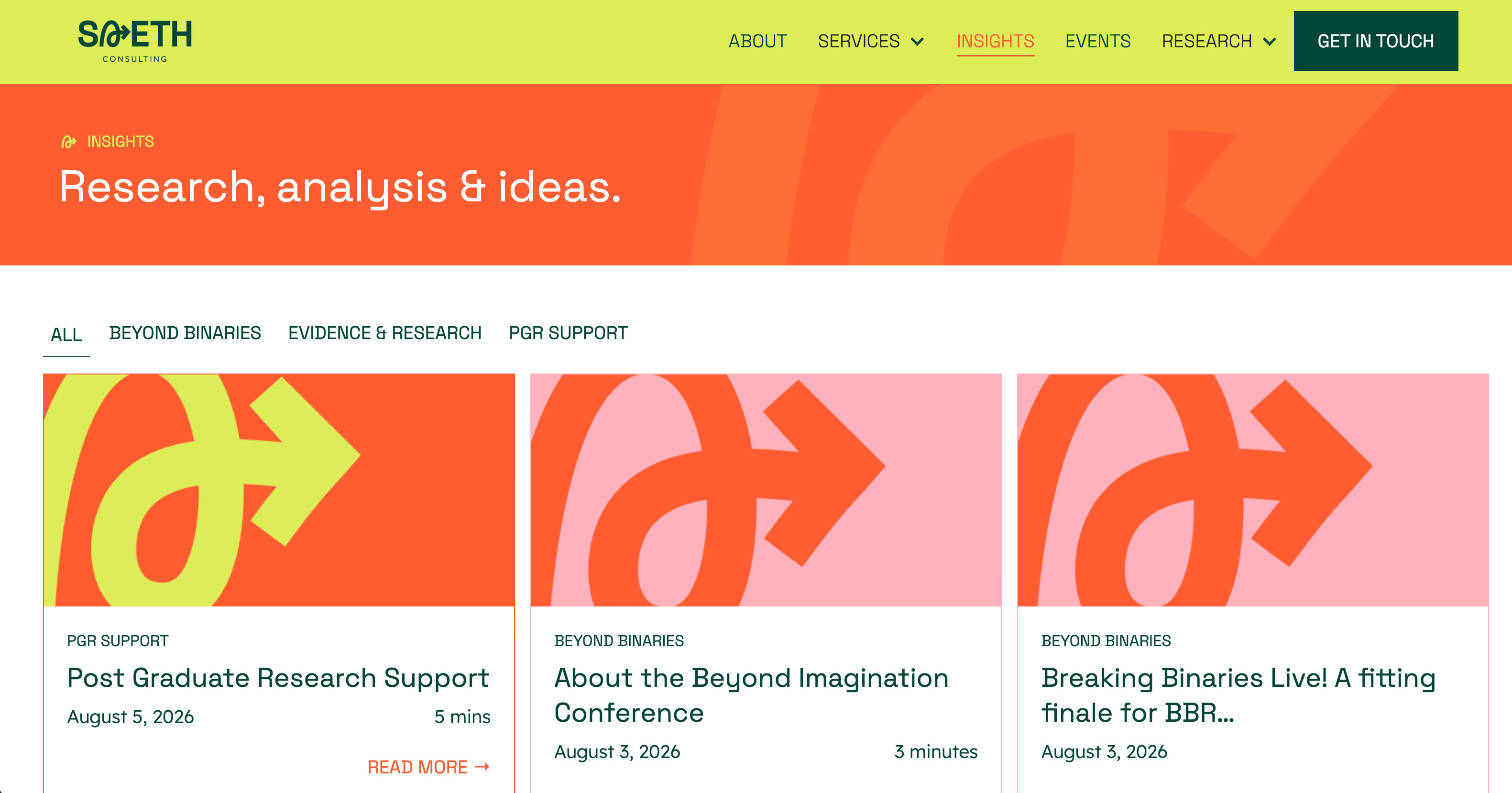
With a lot of information to display and no imagery to break up long stretches of text, content had to be made genuinely scannable. Simple, but still carrying personality rather than defaulting to plain blocks of copy. Blocks and cards do a lot of that work, breaking dense information into distinct, bite-sized pieces instead of long-form paragraphs. Custom branded imagery was created for the blog specifically, with a different colour scheme per category, giving even the written content its own visual break. The whole site is built to feel like one continuous flow: everything essential visible at a glance on the homepage, with more depth always just a click further in for anyone who wants it.
05 - The details
Every team member has their own colour scheme carried across the site, and the same logic runs through insight categories and services — each with its own scheme and its own supporting graphics. At a glance, colour alone lets a visitor group and distinguish content without reading a label first, which is the kind of detail that only shows up once you've actually used the site rather than just looked at it.
06 - The build
A robust CMS, not a static site
Events, insights, team members, and services all run on their own CMS collections in Webflow, so the team can update any of it themselves without touching the design.
Built for what's needed now, room for what's next
The build covers what the site needs today, with hidden elements built in and ready to switch on the moment there's content for them — case studies, testimonials, and more can be turned on later without a rebuild.
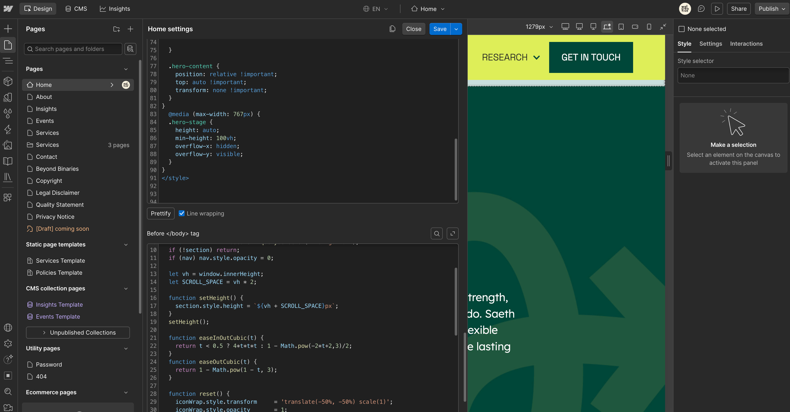
Animation on GSAP
All motion across the site runs on GSAP, giving the loading and scroll-reveal animations the control needed to feel deliberate rather than like a stock Webflow interaction.

_0000_Layer-4.png)
_0001_Layer-3.png)
_0002_Layer-2.png)
_0003_Layer-1.png)
