

01 - The brief
Zion Landscapes only had a domestic offering and wanted to push into commercial work — but domestic branding doesn't read as credible to a facilities manager or procurement team. The brief was to create a genuinely separate commercial brand, professional enough to be trusted by businesses, research parks, and public sector clients from the first click.
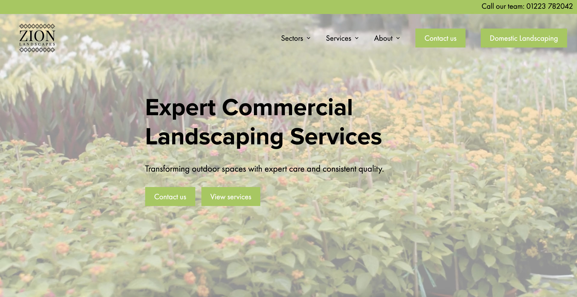
02 - The first impression
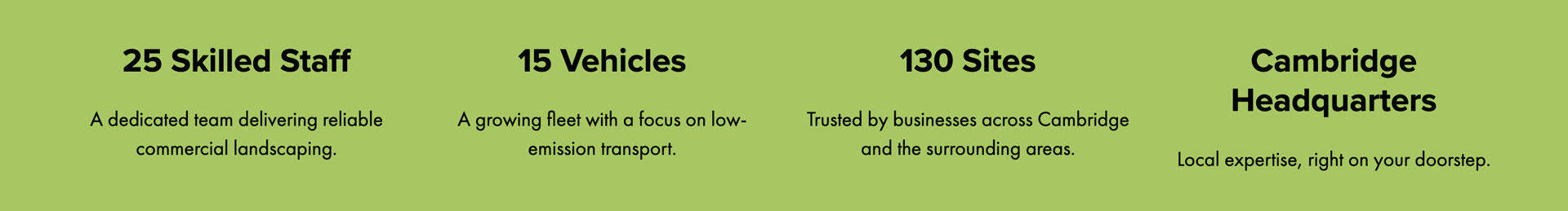
A B2B buyer vetting a new contractor needs trust established before a pitch lands, so the hero sequences scale metrics — staff, fleet, sites — ahead of any value proposition. Capacity is proven before anything is sold.
03 - Brand + Tone
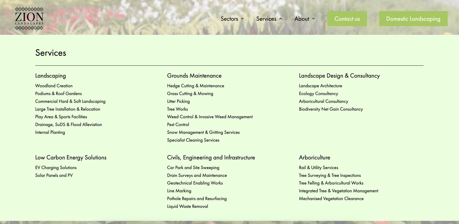
Most competitors compress their offering into a handful of generic services to look tidy. Here the full catalogue — 11 sectors, 30-plus services — is left visible in the nav deliberately: for a buyer comparing contractors on breadth of capability, hiding it would cost more credibility than a dense menu loses.
04 - Structure + Flow
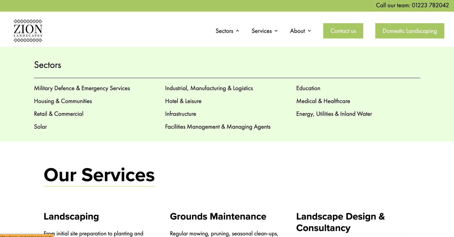
A facilities manager searches by sector ("who handles education sites"), while a council procurement lead searches by service ("who does arboriculture"). Building both as first-class entry points to the same content means no visitor has to translate their own framing into the business's internal one — fewer clicks between intent and the right page, which is usually where B2B enquiries get lost.
05 - The details
A procurement decision-maker comparing several contractors in one sitting isn't reading paragraphs — the accreditations section reduces credibility claims to icon-plus-one-line cards, built for a five-second scan rather than a considered read, because that's genuinely how this content gets consumed at that stage of the buying process.
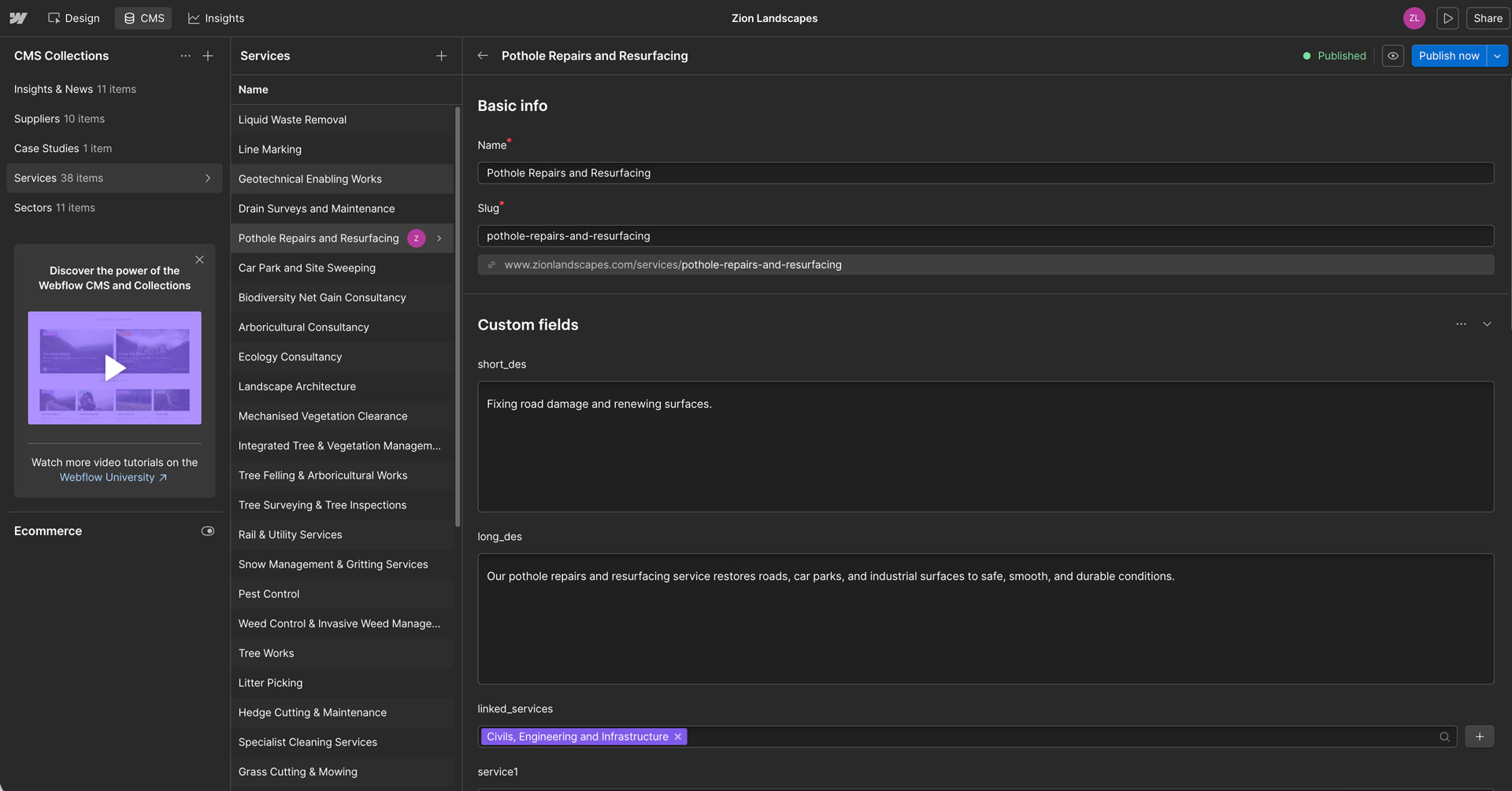
06 - The build
Sectors and services run as cross-referenced Webflow CMS collections rather than static pages, so a service like arboriculture can be edited once and correctly reflect across every sector page that references it — a direct response to how large the catalogue is and how quickly manual duplication would drift out of sync.
07 - Memberships
A well-designed footer supports good UX by acting as a clear safety net for users, offering quick access to key information when they reach the end of a page. Grouping links into logical sections improves scannability, while clear labels and consistent typography reduce cognitive load. Including contact details and secondary actions helps build trust and supports users who are looking for reassurance or next steps.
08 - Search system
The card-based layout introduces structure and rhythm across the page, helping break large amounts of information into approachable, scannable pieces. Consistent spacing, alignment, and iconography guide the eye naturally, making it easy for users to understand hierarchy and flow without conscious effort. Subtle depth and separation create clarity between elements, while the restrained visual treatment keeps the experience feeling calm, considered, and cohesive, even as the content scales.
07 - The result
Feedback has been strongly positive — clients and prospects describe the site as professional, which was the entire point of splitting out a commercial brand. SEO has paid off too: Zion Landscapes is ranking higher and pulling in more traffic, and that traffic is converting into real calls and form submissions rather than just page views.

_0000_Layer-4.png)
_0001_Layer-3.png)
_0002_Layer-2.png)
_0003_Layer-1.png)

