The Hope Studios website is unapologetically brand-led, designed to pack a punch through bold aesthetics and confident restraint. Subtle animations and a polished loading sequence add rhythm and personality, giving the brand space to shine without distraction. Every interaction feels intentional, turning the site into a strong, memorable expression of the studio’s identity.
_0001_Layer-3.png)
_0003_Layer-1.png)
_0000_Layer-4.png)
_0002_Layer-2.png)
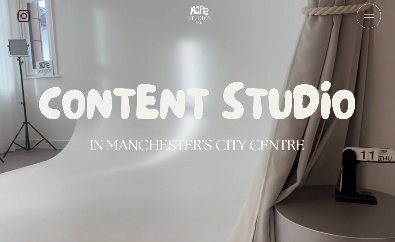
This hero moment puts branding front and centre, using oversized, characterful typography and a full-bleed studio visual to make an immediate statement. Subtle motion and soft transitions add polish without distracting from the message, letting the space and identity do the heavy lifting. It’s bold, confident, and designed to be felt as much as it is read.
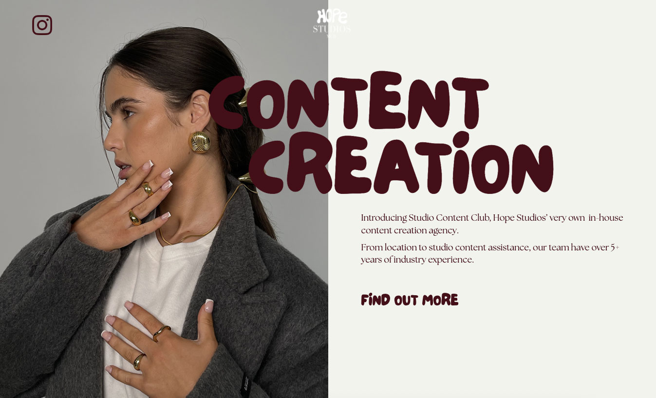
This split layout uses bold, characterful typography alongside strong editorial imagery to let the brand speak loudly and confidently. The contrast between image and type creates instant impact, while the relaxed spacing keeps the composition feeling calm and considered. It’s a playful, fashion-led moment that reinforces the studio’s creative confidence and visual identity.
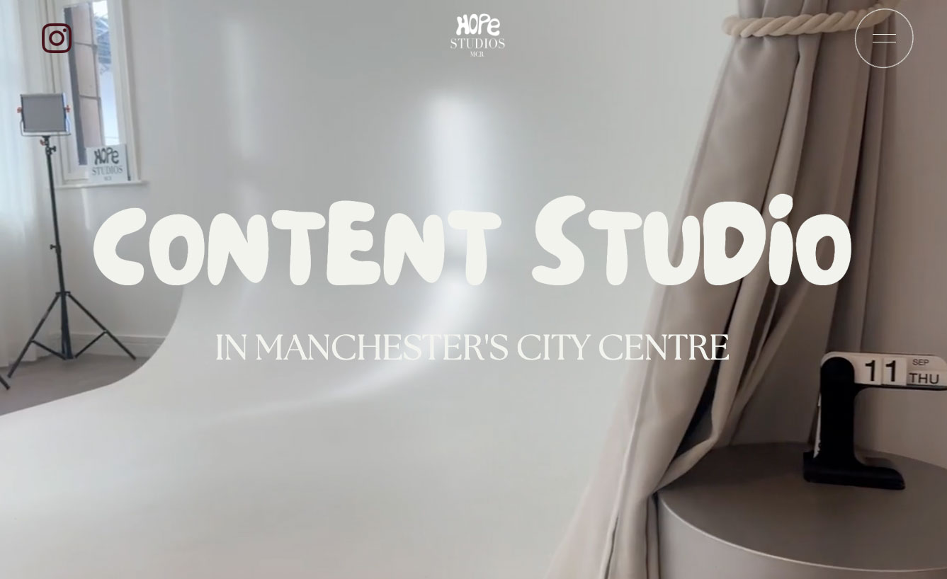
This auto-playing image slider brings energy and movement to the page, using behind-the-scenes visuals to reinforce the studio’s hands-on, creative approach. The oversized, playful typography anchors the motion with a strong brand voice, while the sliding imagery adds rhythm and flow. It’s a lively, scroll-stopping moment that keeps the experience feeling dynamic and expressive.